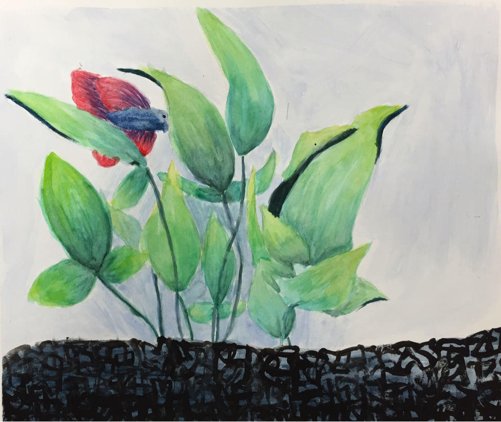
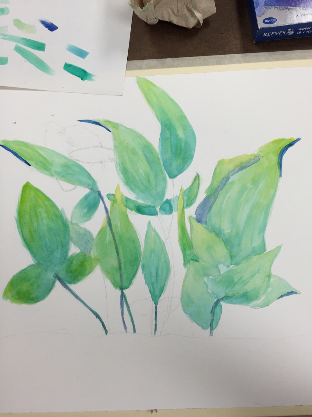
For this piece I decided to do the inside of my fish tank because it's not an everyday interior. For the leaves I used various shades and colors of greens/blues. I think the leaves would've turned out better if they were less of an overbearing green. The colors should've been softer and more fluid. I like the colors I used for the fish but not the fish itself, I should have gradually layered the colors to show detail. My favorite part about this piece is the gravel. I did a blue wash for the background then I mixed black and purple together to create a dark color. I then moved the brush in a scraggly way to create texture and contrast with the lighter colors. Water colors were challenging to use because sometimes the colors were over saturated and I couldn't get the detail that I was hoping for.
 RSS Feed
