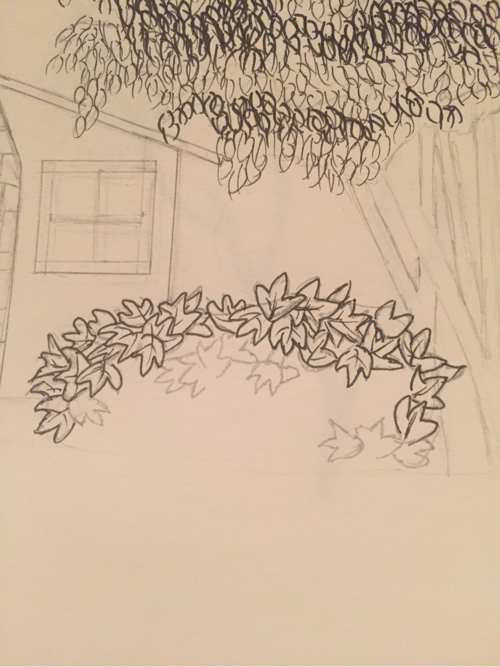
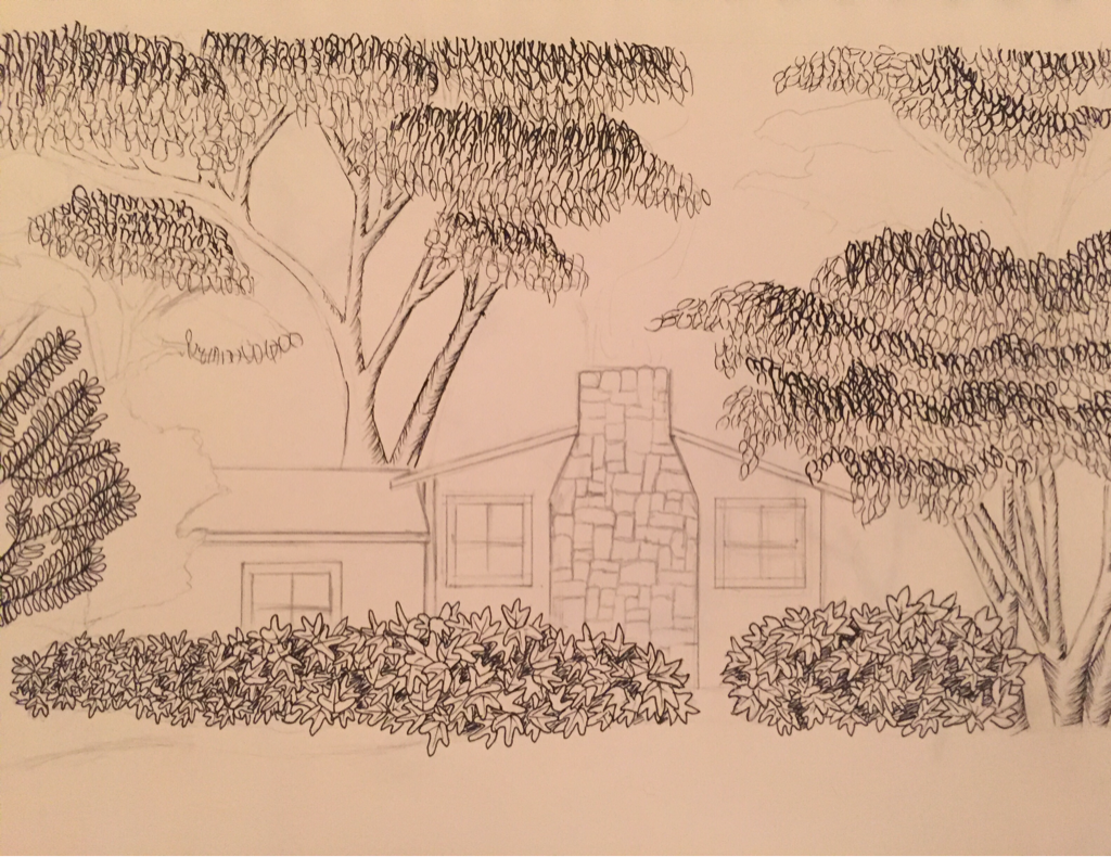
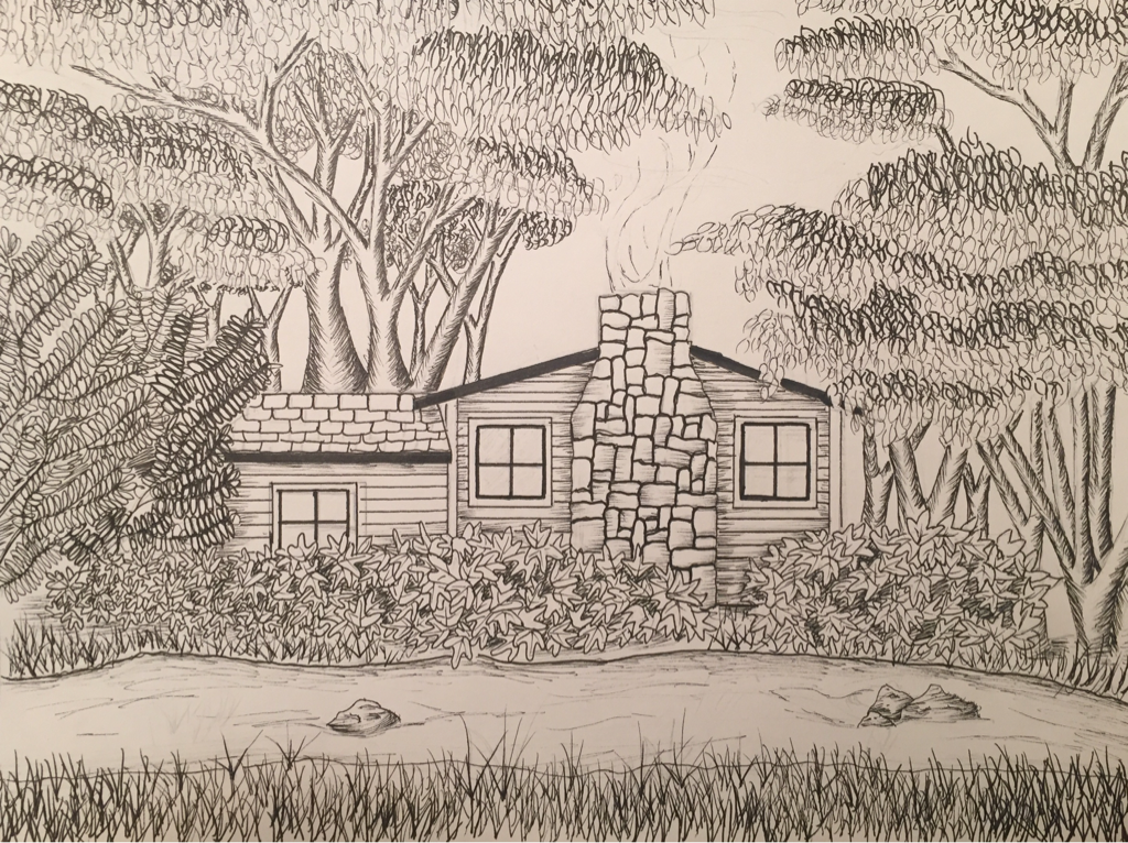
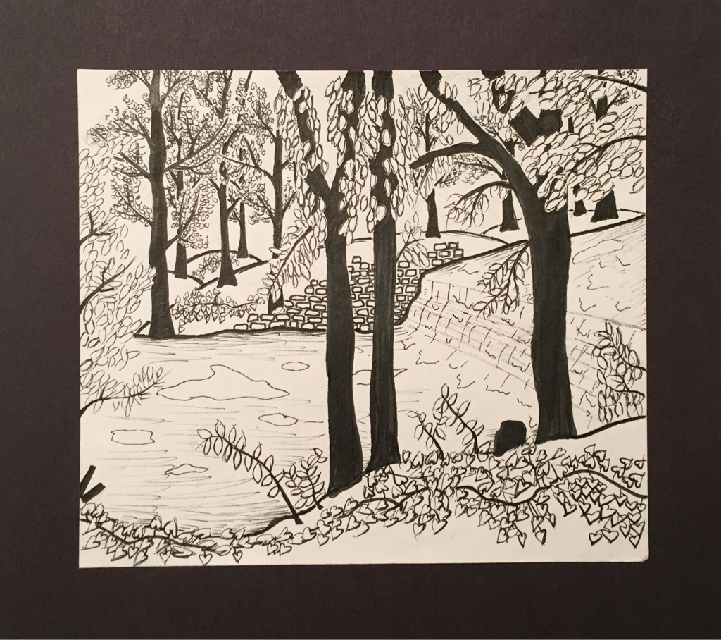
For one of my first concentration pieces I decided to do Bears Den Cabin from a park in my hometown. I did change things up from the original photo to make the piece more eye catching and detailed. The first stuff I started to do was the leaves on the trees and bushes. I had to look up various styles of leaves and techniques to use. For the larger trees I created the leaves using whisps which was simple yet time consuming. For the tree on the far left I did continuous loops and used a thicker pen for the leaves farthest away from the viewer. The most challenging were the bushes because I was undecided of how to make them up. After trying different ideas I ended up with the three pointed leaves. I shaded some areas of the bushes to create depth. The cabin was the easiest part of this piece because all it was, was shading and straight lines. Then after a long time of coming up with ideas, I decided to put a little stream in the foreground with grass around it. I love this piece because it shows how secluded this cabin is and the beauty that surrounds it.
I chose to use one of my pictures I took over the summer as a reference. I decided to use one of my favorite mediums, pen and ink. I also decided to go small because of the medium I chose. I used different techniques to portray certain elements such as the trees and leaves. I made whisps to create the tree leaves and heart figures for the vines. I decided to color the trees pure black so it they would contrast to their surroundings. One major decision was to only use ink but no ink washes because I like the simplicity of this piece. This is one of my favorite pieces I've done all this year because it's simple but also has detail such as the background. I hope to become more intricate when it comes to pen and ink.
This is the product of an online challenge that comes out with a certain photograph that you must somehow replicate. I decided to use prisma color pencils and incorporate a wide array of colors. I chose warm and cool colors throughout the whole piece. I used the cool colors for the shading and blended them into the oranges and yellows. Even though I did not win the challenge, this is the best prisma color piece I have done.
I chose to paint my dog who passed away a year ago. Acrylic paint was the medium I used which was a huge mistake because it is incredibly hard to blend and get the browns I needed. Another challenge was getting the texture for the fur, I chose a skinny long brush to use for the fur but it still ended up not looking realistic. If I was able to do this over I would choose a different dog with less complicated fur, use a different point of view, and a different background. However, animals are not the easiest thing for me and I do not plan on painting one again.
This project was a collaboration between my Mentee and I. We were instructed to create a mixed media piece using whatever materials that came to mind. Our main colors were blue, purple, and gold. We layered different shades of purple and blue tissue paper to cover the matte board completely and set a base for our later additions. Sparkles were added to the piece for a popping aspect. However, there are not a ton of layers on this piece but I'm okay with that because I didn't want the piece being too busy. This was an interesting activity to do because throughout all my art classes I've never done an actual collaboration. Working with someone is nice but you do have to compromise on what you want done with the piece. We later then cut the mixed media into sections and I choose this corner piece because I like the contrast of the purple with the sparkles and gold. I would like to do another mixed media piece but have more time and more control over it.
My Mentee is Danielle. We talked about several things such as her favorite medium so far, her previous art pieces, and what she is currently doing in Art 1 and her plans for that project. Her blog link is http://danielle-apex-2016.weebly.com/. What I find most interesting is she is free thinking about the art that she does and her use of shapes in her pieces.
To get the picture of me underwater I submerged my head half way under water and took a picture. I chose to do this because it would look more interesting than a normal self portrait. The front of my face was drawn with graphite pencil and the surrounding area is done in acrylic paint. This piece wasn't too challenging but the getting the proportions right was the only problem. I love this piece because it's very simple but is different because of the various mediums I used. For the background I used a deep blue for my hair and kept going over with a smaller brush so you could see the texture. After that I watered down blue acrylic and went over where the water was supposed to be. This created depth but also shows the top of the water. Overall, I am proud of this piece because it does look like me, the colors are different but similar, and it's unique.
This piece revolves around the idea of nature turning mechanical. I had multiple ideas that involved animals with a soft texture. I decided to do poison dart frogs for my nature aspect because the colors stand out from the metal and would be interesting to draw. I started off practicing how the frogs would be half mechanical and ended up having the metal rip through the skin and have bolts for fingertips. This piece was very challenging to do because I am not skilled when it comes to prisma colors. Blending colors and trying to achieve a realistic aspect in the piece were the most challenging areas. The only parts that I am happy about is the background color and where the rocks enter the water. However, I might go back and add more shading in the rocks to make them pop out more, same with the leaves.
For this piece I decided to do the inside of my fish tank because it's not an everyday interior. For the leaves I used various shades and colors of greens/blues. I think the leaves would've turned out better if they were less of an overbearing green. The colors should've been softer and more fluid. I like the colors I used for the fish but not the fish itself, I should have gradually layered the colors to show detail. My favorite part about this piece is the gravel. I did a blue wash for the background then I mixed black and purple together to create a dark color. I then moved the brush in a scraggly way to create texture and contrast with the lighter colors. Water colors were challenging to use because sometimes the colors were over saturated and I couldn't get the detail that I was hoping for.
This art piece is my first oil painting. I decided to do a masquerade mask for my object. To acquire the purple and pink tones I got a purple light and put it against the mask while I took pictures. I used a dark plum color for the background and made it gradually get lighter where the light was hitting. Creating value in this piece was one of the hardest things to do because all of the colors were similar but different shades. My favorite aspect of this piece are the sparkles. To make the sparkles realistic I used black, white, and gray. Using these colors added depth and a realistic feel. However, I wish I would've done more detail with the feathers because there needs to be more depth and texture. This is probably my favorite piece because the colors are so rich and deep and it does have a realistic feel. After this project, I do want to do more oil in the future.
|
AuthorWrite something about yourself. No need to be fancy, just an overview. Archives
May 2016
Categories |